Some videos about contemporary architecture from the latest years made in Andalusia by (quite young) Andalusian architects in a quick update again, just as a sample of what kind of excellent architecture it's made here, in the south of Spain. Enjoy! (English subtitles automatically available)

jueves, 27 de junio de 2013
Andalusian architecture
Rápida entrada con algunos vídeos sobre arquitectura contemporánea de los últimos años hecha en Andalucía por (jóvenes, en su mayoría) arquitectos andaluces, tan sólo como muestra de la buena arquitectura que se hace por el sur. Disfrutadlos!
Some videos about contemporary architecture from the latest years made in Andalusia by (quite young) Andalusian architects in a quick update again, just as a sample of what kind of excellent architecture it's made here, in the south of Spain. Enjoy! (English subtitles automatically available)
Some videos about contemporary architecture from the latest years made in Andalusia by (quite young) Andalusian architects in a quick update again, just as a sample of what kind of excellent architecture it's made here, in the south of Spain. Enjoy! (English subtitles automatically available)

sábado, 8 de junio de 2013
El Viejito
 |
| ¿No hay algo aquí de Paul Rudolph? Seminario Pontificio Mayor, Santiago, Cristián Fernández Cox |
Fue profesor mío de Teoría de la Arquitectura Moderna, durante mi intercambio en Chile. En clase, cariñosamente, lo llamabamos "el Viejito". Fue una gran suerte y una gran experiencia contar con su bagaje y su visión de la arquitectura, la cual me parecía muy lógica, y que comparto totalmente. El hablaba del porqué de la particular modernidad chilena -que no era esa arquitectura racionalista que se estaba llevando a cabo en los últimos años-, situando el contexto de cómo la arquitectura moderna llegó a ese país, él hablaba en sus clases de una modernidad barroca, diferente del resto de Sudamérica. "Los arquitectos chilenos somos hijos de la modernidad barroca"
Además de todo esto, él hablaba de su concepto de buena arquitectura, ligada al lugar y a su experimentalidad. Él lo llama la bien estancia, el concepto de que un usuario pueda llegar a decir, de un lugar arquitectónico, en sus propias palabras ¡qué bien se está aquí! Os dejamos aquí el vídeo con la entrevista completa. ¡Disfrutadlo!
We bring you a quick update today, due to a lack of time again. This is about a clip of the architect Cristián Fernández Cox who granted an interview in a cultural TV programme of Chilean television (sorry but it's in Spanish and I fear the subtitles are not available). He was awarded with the National Architecture Award in 1997 and the America Architecture Award in 2011 (Rogelio Salmona, Luis Barragán and Eladio Dieste were awarded previously too, among others).
He was my teacher in Theory of Modern Architeture during my international exchange placed in Chile. We all called him, fondly, "the Oldie man". I was so lucky and enjoyed quite a lot attending his lessons, in which he transfered us his own and personal architectural vision and all his knowledge, which I totally gathered as I found it very reasonable. He talked to about how different the Chilean modernity was, regarding to others South American countries, its particular causes and the origins of it in Chile. Often, he spoke that Chilean architecture is baroque, not racionalist -as all the buildings which were being built in that country in the recent years-, a Baroque modernity. "We, Chilean architects, are sons of Baroque Modernity" he used to say.
What is more, he always mentioned his very own concept of what makes architecture good, which should be quite related with the context and about its experience with users. He calls to this the good livingness (sorry for the term, I have tried to translate it as much real as I think it may be in English ), when people who experience that architecture, can reach to say, in Fernández Cox's own words ¡This place makes me feel good! Here it's linked the video with the whole interview. Enjoy it if you can!
sábado, 1 de junio de 2013
Enric Miralles (I)
Breve actualización con uno de los arquitectos más brillantes que ha dado España, el gran Enric Miralles. Sus textos, breves pero intensos, transmiten conceptos básicos relacionados con los proyectos que estaba llevando a cabo en cada momento.
Published in El Croquis, Enric Miralles 1983-2000, El Croquis Editorial, SL, Madrid, 2005
 |
| Interior del centro social de Hostalets / Hostalets Civic Centre inner view |
Caminar…
Caminamos como escritura en la
superficie sobre la que nos movemos o pensamos…
Ese trazo que responde al
movimiento que creemos descubrir en el lugar. Aquél elemental signo que
acompaña el ir de un sitio a otro… Fragmentos de estos movimientos describen
una geometría ligada a lo real: son envolventes de contornos reales.
En Parets unas cubiertas acompañan
de un modo aproximando el acto de caminar… Dibujan un camino al observador. En
este sentido, como las rampas de Hostalets, no nos indican un camino que
tengamos que recorrer, sino que son quienes dan forma al proyecto. Gradación de
sombras… Es un dibujo que se relaciona con el movimiento de un modo marginal.
Son unos trazos que ocupan la
totalidad del espacio, tocando sus puntos más extremos… Responden a esos trazos
intuitivos con que tachas una zona para marcarla… Desde los límites al
interior. Son lo más lejano a las marcas que encierran una propiedad. En el
Cementerio, ese signo es un modo de pensar lo natural, siguiendo la noción de
precisión que comporta un camino. Corta como lo hace un sendero. Separando los
fluidos a su paso…
Si en Parets le pedíamos a este
camino ser intuitivo, aquí es un doble movimiento de ida y vuelta que ocupa
todo el terreo, dejándolo intocado. Desarrollar el proyecto ha sido alejarnos
de los aspectos narrativos a los que los camino en los jardines están
acompañados, que en un cementerio se hacen insoportables. Ha sido trabajar en
el interior de los trazos previos: detenernos en el movimiento.
Detenernos en pensar otra cosa,
multiplicar las bifurcaciones, los espacios intermedios, los lugares de escape…
La Z y la S, nos cuenta R.B., son la misma letra vista desde el otro
lado del espejo… Aquí ahora es el trabajo en el interior de ese corte oblicuo.
La S nos hace posible la Z, o a la inversa.
Publicado en El Croquis, Enric Miralles, 1983 -
2000, El Croquis Editorial, SL, Madrid, 2005
 |
| Edificio de entrenamiento Tiro con arco / Archery range main building' plan |
Just a light update with a text from one of the most finest Spanish architects ever, the unique Enric Miralles. His lines are shorts,very intense, and they carry brief concepts related with some projects which were in progress at the time.
 |
| Sección de la ampliación del Museo Real de Copenhague / Enlargement of Royal Museum in Copenhague section |
Walking...
Tracks as writting on the surface we move or ponder on... That trace which corresponds to the movement we believe we discover in the place. That elementary sign accompanying the shift from one place to another... Fragments of these movements describe a geometry linked to reality: they envelop real shapes.
In Parets, several roofs roughly accompany the act of walking... they draw a path for the observer. In this sense, like the Hosptalets ramps, they do not show us the path we have to take, but rather are ones that give shape to the project. The graduation of shadows... a sketch that relates to the movemenr of a marginal mode. They are traces that occupy the whole space, touching its extreme points. They correspond to the intuitive lines with which you cross out a zone to mark it... from the edges inwards. They are furthest away from the marks that enclose a property.
In the cemetery, that sign is a form of thinking naturally, following the notion of precision that makes up a path. It cuts across like a trail, dividing the fluids as it goes...
If we wished the path in Parets to be intuitive, here a dual there-and-back movement what is what covers the whole terrain, leaving it untouched. Developing the project has meant distancing ourselves from the narrative aspects that accompany garden paths, which in a cemetery are unbearable. It has meant working inside the foregoing lines: halting in movement.
Halting to think of something else, multiplying the forking paths, the intermediate spaces, the escape points... R.B. tell us that Z and S are the same letter seen from opposite sides of the mirror... Here, it is work inside such an oblique cross-section. S makes Z possible for us, or vice versa.
Published in El Croquis, Enric Miralles 1983-2000, El Croquis Editorial, SL, Madrid, 2005
martes, 14 de mayo de 2013
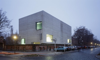
Warning: CUBE EPIDEMIC!
¿Hay una nueva epidemia de cajas neutras, a ser posibles de hormigón o encaladas -mientras más neutras, mejor-, con ventanas dispuestas al tuntún y fachadas planas?
No importan la procedencia, el contexto ni siquiera el programa. Cubos y cajas neutras, planas.
Vamos, hombre! La arquitectura no es sólo esto.
No hay que pasarse con el tema de la austeridad y del tan manido y supuesto "minimalismo". El Movimiento Moderno ya pasó y lo hacían mucho mejor que hoy día, así que es hora de parar.
Y aquí sólo elegimos unas cuantas fotos...
Is it taking place a new epidemic of neutral, as much as possible concrete-made or painted in white -the more neutral, the better-, and plain facades boxes whose windows are arranged randonmly? No matter origin, context or even programme.
Cubes, boxes, neutral plain boxes.
Come on guys! No way. Architecture is much more than that.
There is no point in going on talking about austerity and the overused "minimalism". International Style happened years ago and its master pieces were much better than any which we might do currently, so it's time to let it go.
And we only picked some pictures here, there are tons like these below...



A. Einstein
No importan la procedencia, el contexto ni siquiera el programa. Cubos y cajas neutras, planas.
Vamos, hombre! La arquitectura no es sólo esto.
No hay que pasarse con el tema de la austeridad y del tan manido y supuesto "minimalismo". El Movimiento Moderno ya pasó y lo hacían mucho mejor que hoy día, así que es hora de parar.
Y aquí sólo elegimos unas cuantas fotos...
Is it taking place a new epidemic of neutral, as much as possible concrete-made or painted in white -the more neutral, the better-, and plain facades boxes whose windows are arranged randonmly? No matter origin, context or even programme.
Cubes, boxes, neutral plain boxes.
Come on guys! No way. Architecture is much more than that.
There is no point in going on talking about austerity and the overused "minimalism". International Style happened years ago and its master pieces were much better than any which we might do currently, so it's time to let it go.
And we only picked some pictures here, there are tons like these below...


"Si un escritorio desordenado es un sinónimo de una mente desordenada, entonces ¿Qué debemos de pensar de un escritorio vacío?" A. Einstein
"If a cluttered desk is a sign of a cluttered mind, just what does an empty desk mean?" A. Einstein
domingo, 12 de mayo de 2013
Do you really know what you eat?
Nuestro estilo de vida ha cambiado en el último siglo más que en ningún otro período de nuestra historia. Uno de estos principales cambios atañe a la comida, nuestra base: condiciona nuestra salud y por lo tanto, nuestra vida. Aquí van unos cuantos documentales que debemos conocer sobre este tema. Seguro que a partir de aquí, vigilaremos más lo que comemos. Como ejemplo, el trailer de Food Inc.
Our lifestyle has changed, during this last century, more than in any other period of our recent History. And our food, as a consequence, which is one of its main basis: it determines our health and, furthermore, our lives. Here you have some must-see doumentaries about this vital topic. We are sure forward you all will take more care about what kind of food you eat. As a sample, the trailer of the shocking and polemic Food Inc.
Our lifestyle has changed, during this last century, more than in any other period of our recent History. And our food, as a consequence, which is one of its main basis: it determines our health and, furthermore, our lives. Here you have some must-see doumentaries about this vital topic. We are sure forward you all will take more care about what kind of food you eat. As a sample, the trailer of the shocking and polemic Food Inc.
- Food Inc.___________________Español English English with Spanish sub.
- ¿Sabes lo que comes?______Español
lunes, 22 de abril de 2013
Comparisons are NOT hateful v.05
Hoy vamos un paso más allá con la serie de "Las comparaciones NO son odiosas" y mostramos cómo el tiempo/espacio es relativo cuando se habla de pintura y arquitectura, artes ambas que siempre han estado conectadas entre sí.
La tan conocida obra de arte expone el nuevo amanecer -aunque ya llevaba unas 2 décadas dicha tendencia en EEUU- y predominio del estilo de vida americano: Impoluto, perfecto, tecnológico y totalmente controlado. Incluso el salpicón es perfecto. Una imagen que evoca algo que para mucho es el paraíso: buenas temperaturas, playas y California. Tiene que ver con la película Mon Oncle, de Tati, en 1958, que ya avanzaba esa tecnificación e industrialización de la vivienda, paradigma de la modernidad. Obviamente aparecen también en escena las Case Study Houses, que se desarrollaron entre 1944 y 1966; la reinvención de la vivienda americana, tras la II Guerra Mundial, y cómo la industria armamentística, ahora reconvertida, es el motor de este proceso.
Atravesando el océano y con 43 años de diferencia, aparece esta foto, quizás casual, quizás no, de una casa del estudio de Juan Herreros, que junto con su antiguo socio Iñaki Ábalos, han explorado las posibilidades de la industria en el campo de la arquitectura, hasta su reciente separación en 2008. Ellos, como estudio, siempre se han interesado por las posibilidades que ponía la industria al alcance del arquitecto. Los catálogos y las modulaciones han sido dos constantes en el trabajo de ambos, siguiendo con la herencia de las Case Study y el potencial de la industria dentro del campo de la vivienda. Ellos lo han explorado tanto en la vivienda unifamiliar -el ejemplo de más abajo-, como en la colectiva, además de en edificios públicos.
Today we go one step forward with the series "Comparaisons are NOT hateful" showing how time and space are totally relative when it's about painting and architecture, both arts which have alwsays been very related each other.
This well-known artwork depicts a new born -although this tendence started two decades ago in the States- and prevalence of the US: Spotless, perfect, technological, and totally under control American lifestyle. Even the splash is perfect. An image that recalls a heaven on earth: sunny weather, beach and California. Also, all this is related with Jaques Tati's film, Mon Oncle, of 1958 which already imagined such a very high technical and industrialized level, epitome of modernity. Obviously, the picture sounds so similar to the famous Case Study Houses, which were developed between 1944 and 1966 in US, to revindicate the American model of a modern house, after the World War II, whose promoter was the just-reconverted weapon industry.
Crossing the ocean and 43 years later, this photo appears, who knows if it is casualty, maybe not, showing a house from Juan Herreros' office, who together with his old partner Iñaki Ábalos, had been exploring the potential of the industry within the field of architecture, until their recent break up in 2008. They, as office, had always been interested in the possibilities and means which the industrial sector offers to architects. Catalogues and standarisation have been two strong points inside their work, going on with Case Study's heritage and the possibilities of the industry in housing. They have been exploring as much in single-family houses -like this house below-, as in collective housing and public building as well.

Just one last thing, both pictures -as the rest of them from "Comparaisons are NOT hateful", except one- are not mine and are used here without any commercial benefit.
domingo, 14 de abril de 2013
A hidden treasure in Lodz
Hoy os traemos un descubrimiento, gracias a un viaje a un país tan desconocido y tan infravalorado todavía como es Polonia. Más concretamente a la ciudad de Łódź y a su Escuela de Bellas Artes (Akademia Sztuk Pięknych en polaco), diseñada en 1976 por Bolesław Kardaszewski, que desde el primer momento atrajo nuestra atención y nos recordó, creemos que con bastante acierto, a los edificios de Paul Rudolph.
In this occasion, we are bringing a discovery, thanks to a trip to Poland, which is such a very unknown and undervalued country yet as it is. Specifically the city of Łódź and its Fine Arts Academy (Akademia Sztuk Pięknych at Polish), designed in 1976 by Bolesław Kardaszewski, that from the very beggining attracts our attention and recall us, very sharply, some buildings of Paul Rudolph.


Es un edificio interesante, bien articulado en planta -edificio central con una altura superior al resto y varios brazos articulados en torno a él-, con unas cubiertas potentes que vuelan ligeramente sobre el cerramiento, exclusivamente de vidrio y carpinterías con una extraña combinación de colores, negra y roja, que a primera vista podría desentonar con el conjunto. Sin embargo, en vez de ser una desventaja, acrecienta el carácter tectónico del edificio, aportando profundidad.
It's a quite interesting building, well composed in plan -a central body with a taller height and some articulated arms coming out from it-, also very potent cantilever roofs which appear a bit above the external walls, exclusively made of glass and their frames have an unlike colour combination, black and red, which, at a first sight, might don't match all together with the rest. However, instead of a disadvantage, it encreases the tectonic role of the building, providing depth.
 El edificio juega con diferentes planos en profundidad, no sólo volumétricamente, sino en sus fachadas acristaladas, creando sombras y diferentes efectos de no gravedad, además de diferentes ritmos en los huecos de las carpinterías, dándole una dimensión antiescalar y difícil de ponderar.
This building plays with a non-flattered external skin, not only in volume, as its glazed facades, creating shadows and different non-gravity's light effects, as well as a changing rythm in window framings, giving an appearance of no scale and difficult to find it out.
.jpg)

We don't have pictures from interiors, neither from previous state, seeing as, it seems, the building suffered a frame's remodelling in 2007, replacing the orginals, made of wood, including parapets, for some new ones that look like steel made. Definetely a very interesting and contemporary building, hidden in the right centre of Poland, which breaked out of its time's social and political context (in the 60's, Poland was under the influence of Eastern Bloc, in the Cold War's period) to bring modern winds out to a static city, kept at blooming old times, sadly finished.
Click here for extra info (only available in English and Polish, sorry!)
In this occasion, we are bringing a discovery, thanks to a trip to Poland, which is such a very unknown and undervalued country yet as it is. Specifically the city of Łódź and its Fine Arts Academy (Akademia Sztuk Pięknych at Polish), designed in 1976 by Bolesław Kardaszewski, that from the very beggining attracts our attention and recall us, very sharply, some buildings of Paul Rudolph.


It's a quite interesting building, well composed in plan -a central body with a taller height and some articulated arms coming out from it-, also very potent cantilever roofs which appear a bit above the external walls, exclusively made of glass and their frames have an unlike colour combination, black and red, which, at a first sight, might don't match all together with the rest. However, instead of a disadvantage, it encreases the tectonic role of the building, providing depth.

This building plays with a non-flattered external skin, not only in volume, as its glazed facades, creating shadows and different non-gravity's light effects, as well as a changing rythm in window framings, giving an appearance of no scale and difficult to find it out.
Tiene una connotación brutalista, en cuanto a volumen, sin llegar a usar apenas el hormigón en su imagen externa, que le da una poderosa apariencia, al estilo comunista, pero con una sensibilidad infinitamente más arquitectónica y occidental.
It has a brutalist feeling, according to their volumes, without barely using concrete -which it was very popular in Communism times- in its external, powerful, appearance, but with a extremely clear of architectonic sense and, somehow, also western.

No disponemos de fotos de los interiores, así como del estado anterior, ya que, al parecer, sufrió una remodelación de las carpinterías en 2007, sustituyendo las originales de madera, incluidos antepechos, por otras, que se intuye pueden ser metálicas. Definitivamente un edificio muy interesante y moderno, escondido en el centro exacto de Polonia, que escapó al contexto político y social de su tiempo (en los años 60, Polonia estaba bajo influencia comunista, en plena guerra fría) para traer modernidad a una ciudad estancada en un floreciente, y tristemente cercenado, pasado.
We don't have pictures from interiors, neither from previous state, seeing as, it seems, the building suffered a frame's remodelling in 2007, replacing the orginals, made of wood, including parapets, for some new ones that look like steel made. Definetely a very interesting and contemporary building, hidden in the right centre of Poland, which breaked out of its time's social and political context (in the 60's, Poland was under the influence of Eastern Bloc, in the Cold War's period) to bring modern winds out to a static city, kept at blooming old times, sadly finished.
Click here for extra info (only available in English and Polish, sorry!)
Suscribirse a:
Entradas (Atom)